schoolbook

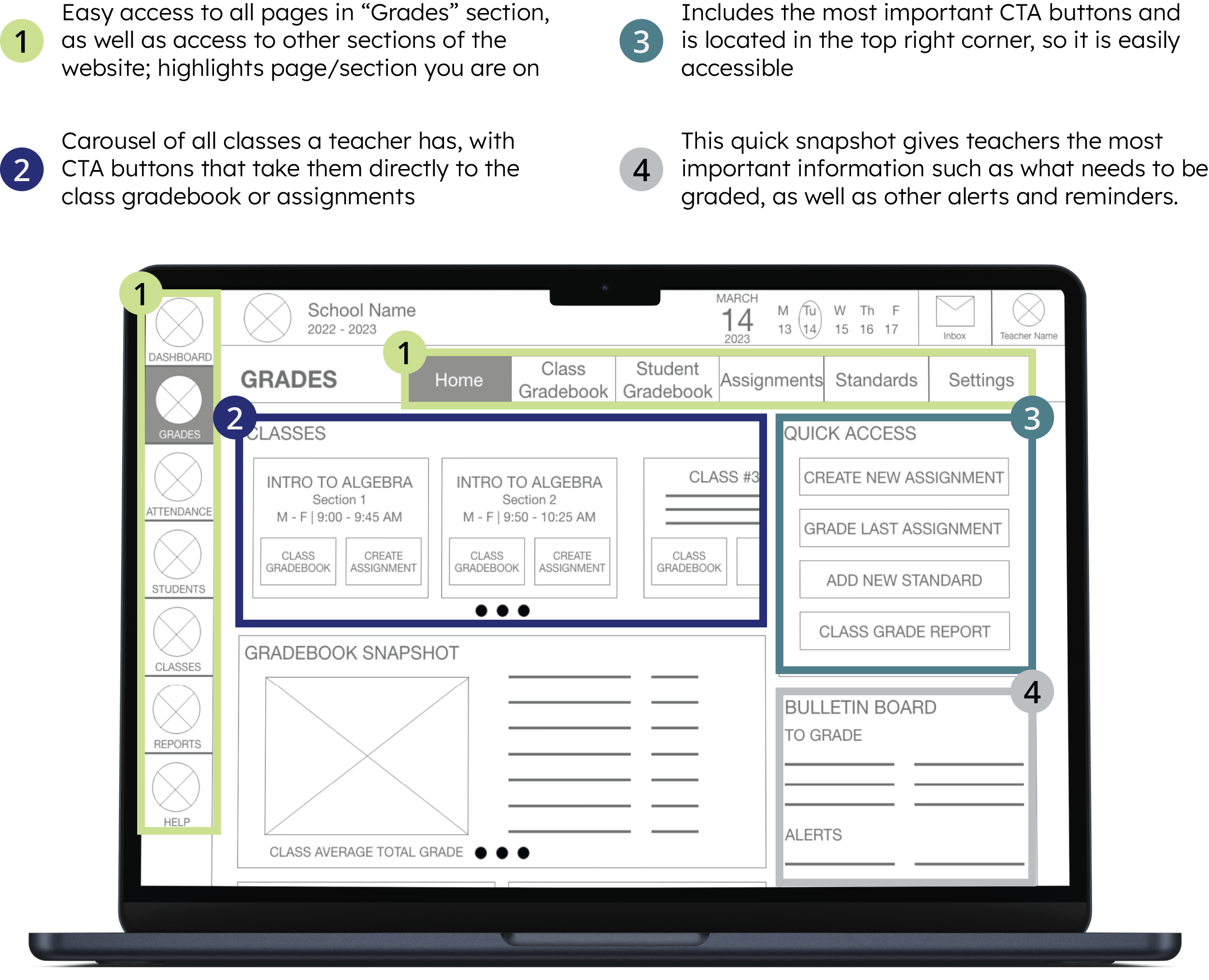
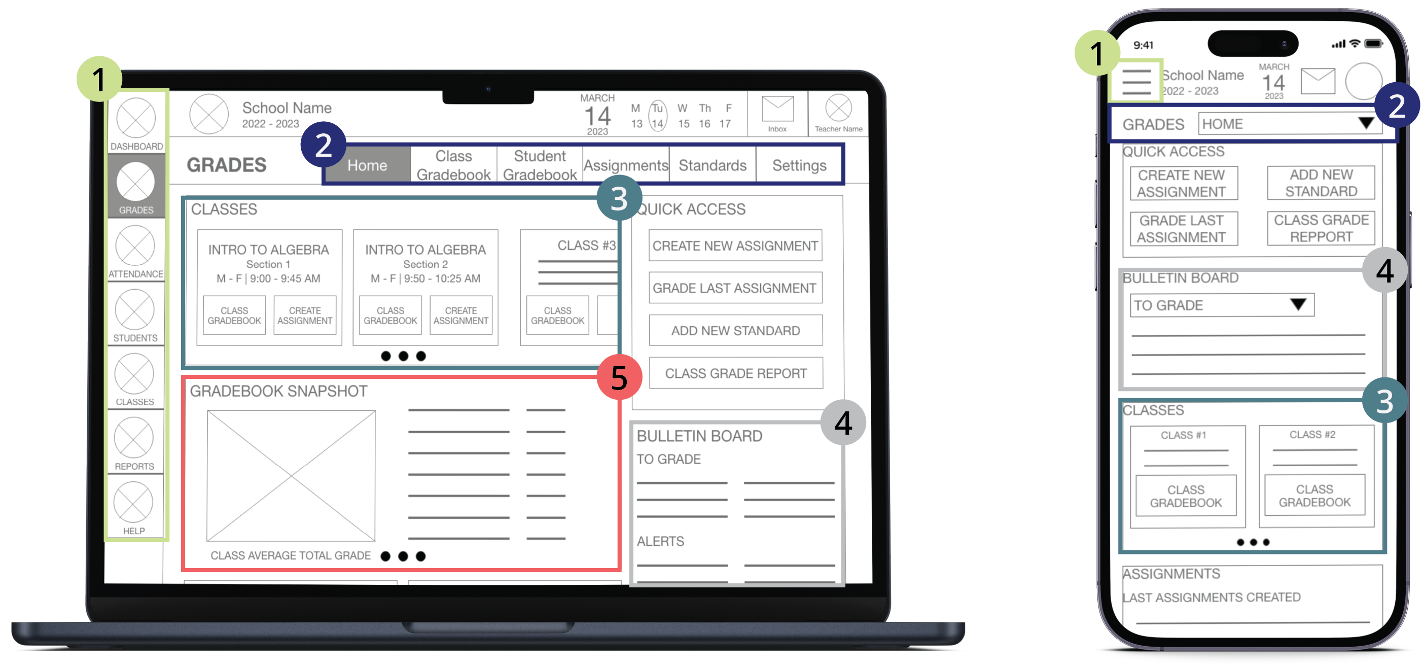
An online student information system (SIS) designed to empower and support educators, administrators, and other school personnel

Laptop screen showing the Class Gradebook
project
overview
objective
Design an intuitive teacher gradebook for a responsive SIS website that gives teachers the crucial information they need to guide their instruction in the classroom
roles
Research
Information Architecture
Prototyping
User Flow
Visual Design
tools
Adobe XD
Adobe Illustrator
Miro
Google Forms
Google Sheets
Google Meet
duration
January 2023 - March 2023
3 months

the problem

Educators are frustrated with present-day SIS’s/online gradebooks.
Educators feel like gradebooks are cumbersome and unintuitive.  Instead of feeling like a tool or resource to enhance their teaching, they feel like it is something they “have to do." Teachers also complain about having to click through many different pages to accomplish something, which makes using the gradebook time-consuming and frustrating.
time-consuming icon
time-consuming

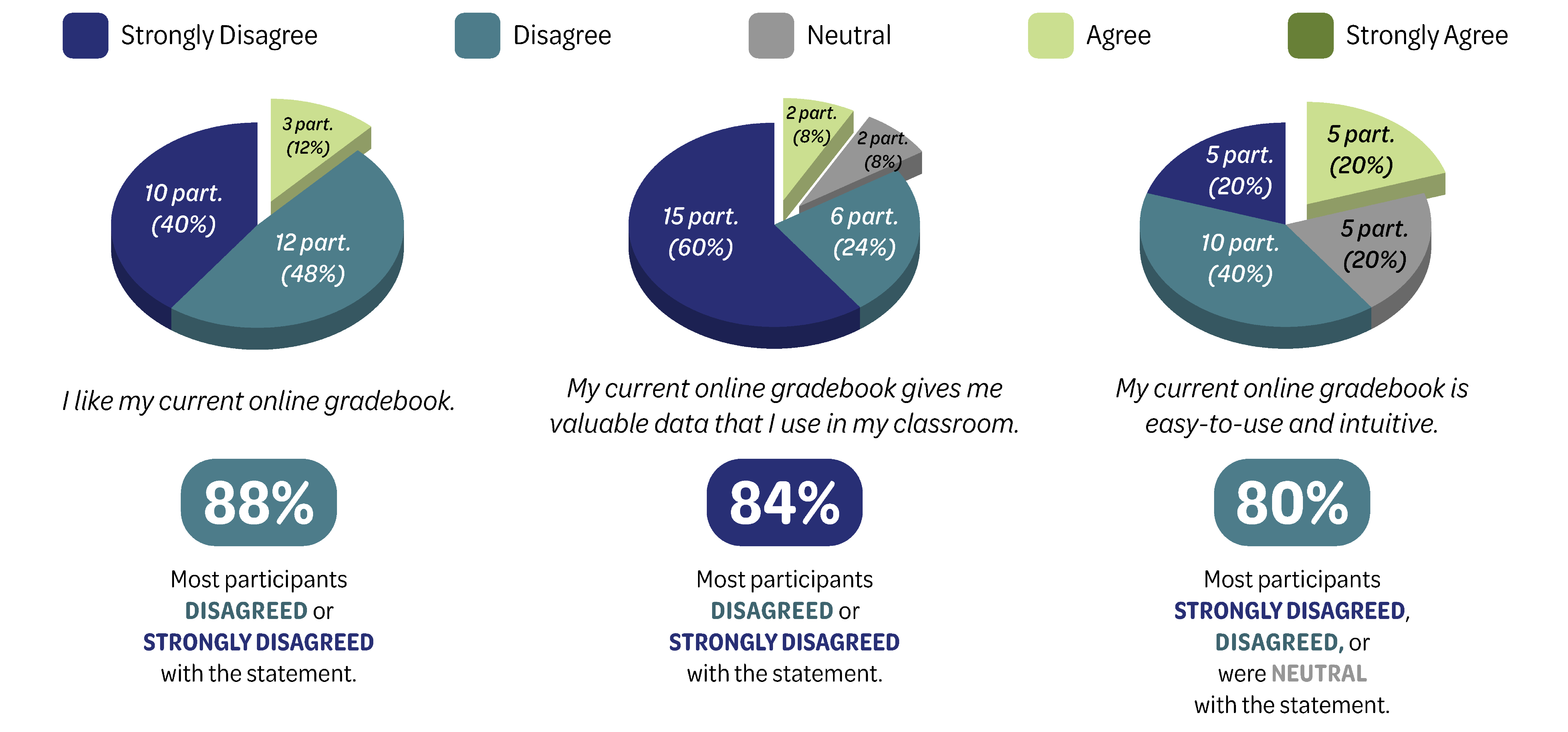
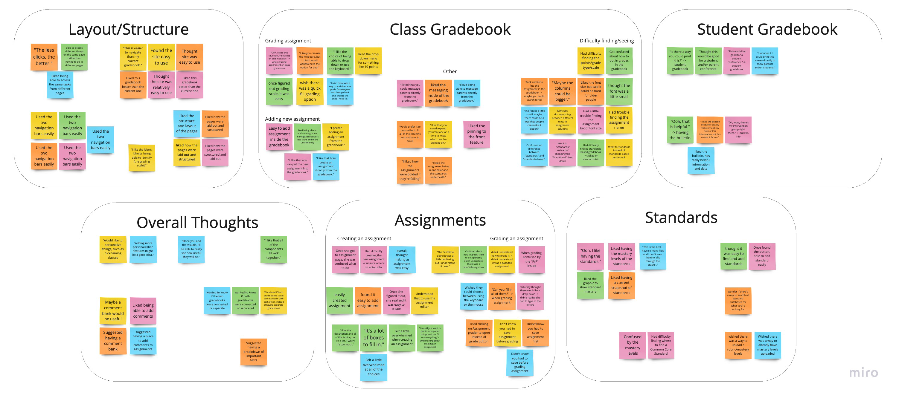
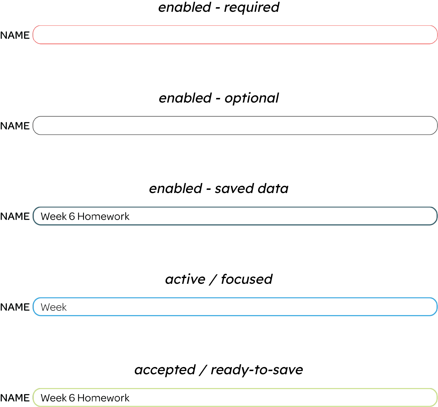
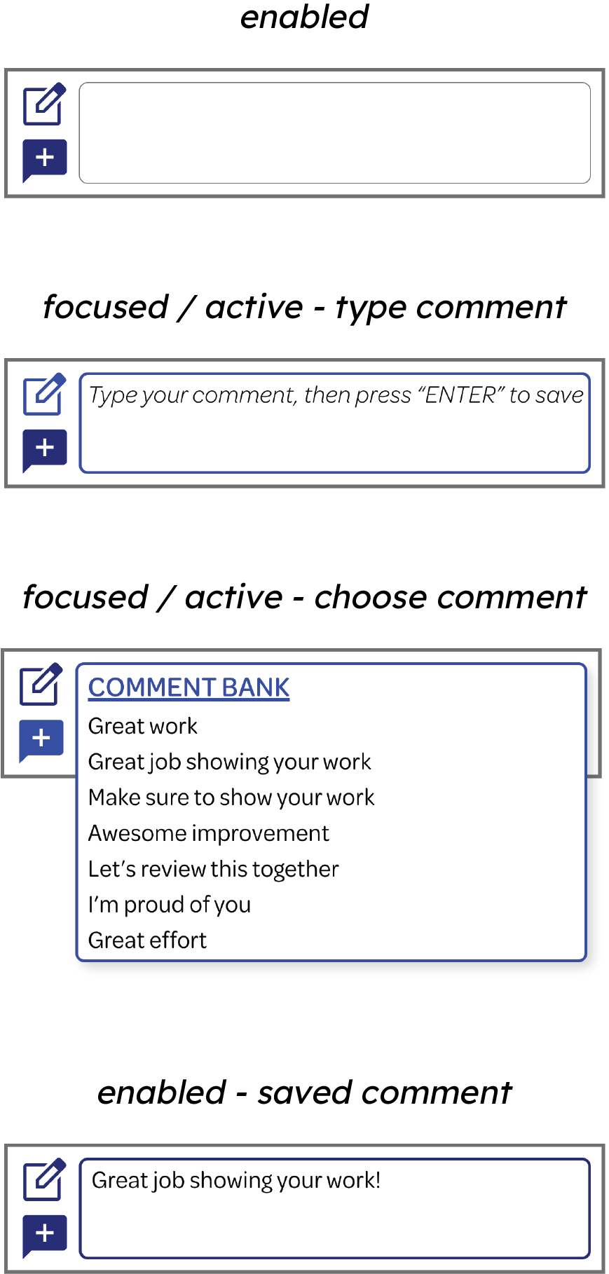
Educators say they don't have enough hours in the day to complete all of the necessary tasks they need to. They are frustrated with how long it takes to enter grades and add comments.

Difficult to learn icon
hard to learn

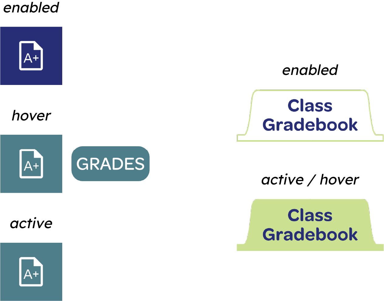
Educators have expressed that their gradebook is unintuitive and requires a learning process to understand all of the functions and features.

difficult to navigate icon
difficult to navigate

Many educators say that their current gradebook is cumbersome and difficult to navigate. It requires them to navigate to too many different pages and have to click too many buttons to accomplish tasks.

data analysis icon
no data analysis

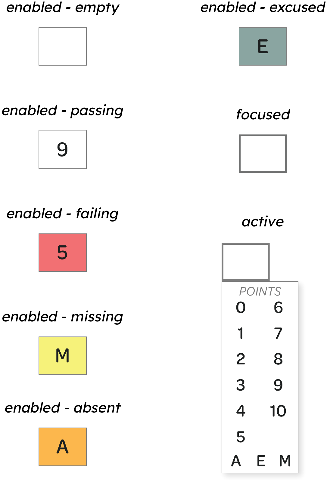
One of the most frustrating things educators complain about is how useless the gradebook is. Most just give a cumulative grade for each student and don't give more useful data such as how well a student is performing in a certain standard or visual representation of data to show student progress.

how might we?

How might we design a system that combines the data educators are seeking with the tool schools need to report grades?
skip past solution to design process

the solution

Person sitting in front of a laptop with the Schoolbook dashboard showing
Person holding a phone in one hand while holding a pencil and writing in a notebook with the other; the phone screen shows the Standards page
Person sitting in front of a desktop with a tablet and notebook in front of them; the desktop shows the Student Gradebook page
Schoolbook is a Student Information System (SIS) for schools and other educational programs. An SIS is an all-encompassing platform for educators, administrators, and other school staff to use for anything school-related. During this case study, I focused on the “Grades” section of the website, which includes a class gradebook, an individual student gradebook, and a seamless transition between a traditional and standards-based gradebook. What sets Schoolbook apart from its competitors is the easy access to visual, realtime data that teachers can use immediately to support the way they teach in the classroom.

key features

GIF scrolling down to show the entire Dashboard page

the ultimate dashboard

A quick snapshot of all of your classes in one place, with the most important information and tasks displayed for easy access

easy & intuitive navigation

Sidebar navigation for quick access between the different sections of the website

Once within a particular section, a tab navigation bar appears at the top of the page to switch easily between the subpages
GIF showing how the navigation works on the website
GIF showing how to transition back and forth between the standard and traditional gradebooks

seamless transition between gradebooks

Seamlessly transition between a traditional and standards-based gradebook, depending on the data you need

individual student gradebook

Get more in-depth information and data about individual students and their progress
GIF scrolling down to show the entire Student Gradebook page
GIF showing how to send a message from the Student Gradebook and Class Gradebook

messaging within your gradebook

Teachers can message directly from the gradebook with a simple click of a button. Users can find the message button throughout the gradebook for easy access.

multiple ways to enter grades

Depending on your preference, you can use your keyboard, your mouse, or a combination of both to enter grades into the gradebook

You get to choose what's easier and faster for you
GIF showing how users can use the mouse or the keyboard to enter grades

initial research

qualitative interviews

Even though I was a former educator and have experience with online gradebooks, I still needed to interview other educators to gain a variety of opinions and perspectives to help with my designs.

The grade levels and subjects taught by each participant are shown here.
Art icon
Art
K - 5th
Language arts icon
Language Arts
3rd
Math icon
Mathematics
7th & 8th
Humanities icon
Humanities
9th - 12th
Science icon
Science
5th
Special education icon
Special Education
6th - 8th
"I have over 200 students that I see in a single semester. I want to make sure I am serving each student as best I can, but it's extremely time-consuming. I wish my current gradebook helped me save time rather than waste my time."
Jayden
Mathematics, 7th & 8th
"Standards-based grading gives me a lot more information on what a student knows and doesn't as opposed to traditional grading. I wish I had a gradebook where I could grade based on standards so that I can use that information to support my instruction in the classroom."
Janet
Language Arts, 3rd
"I want a gradebook that gives me data that I can use right away! I'm tired of having to create a report and fill in all of this information just to get anything of value. Why not just give me the data right there so I don't have to waste time?"
Allison
Humanities, 9th - 12th

survey results

To capture more educational perspectives from around the country, I created a survey to identify current and former educators' opinions about their online gradebook.
Survey Type
Google Form
# of Questions
10 total: 5 questions with 5-point scale; 5 open-ended questions
# of Participants
25 total
Participant Details
Currently or previously employed as a teacher; mix of ages & gender
Shows 3 different pie charts showing the results from different questions on the survey

user pain points

1
too many clicks or pages to accomplish a task
Users expressed frustration with how many different places they have to go to, to accomplish a task, such as creating an assignment that is used for multiple classes.
2
no standards-based grading or choices of grading scales
Users said that they wish there was a way that they could change the grading scale for different assignments. They also wished they could use standads-based grading.
3
gradebook seen as a requirement, not as a resource or tool
Users felt like the gradebook was just another required thing to do; they did not see it as a resource or tool to get valuable information and data about their students to support their teaching.
4
difficulty finding which students have missing assignments
Users said that their current online gradebook made it difficult for them to find out which students had missing assignments and what assignments they were missing.

competitive audit

After gathering information from potential users, I wanted to see what online gradebooks were already on the market. There are lots of online gradebooks, some free and others paid, as well as some that are standalone gradebooks and others that are part of a student information system (SIS).
Table showing the different features the different competitors have and do not have on their websites and/or apps

opportunity areas

transition between gradebooks
Easily transition between standards-based and traditional grading
quick snapshot
Add snapshot or quick report of important things such as missing assignments, students are failing, etc.
visual data
Add visual displays representing data to showcase student and class progress for quick reference
more direct user flows
Create user flows that require less clicks and less pages to navigate to
add color & icons
Add more colors and icons to create more visual hierarchy and increase usability
time-saving features
Create features to save users time, such as quick fill and a comment bank

mapping the design

user journey

After gathering research to better understand users and their needs, I needed to think about the journey educators take to complete the main objective, which is entering grades and getting information from the data.

I decided to map out that journey and think about what educators would be doing and feeling, and ways that I can improve the journey for them.
Chart that shows the user journey of a user who is entering grades for a new assignment for multiple classes and wants a report for the newly-graded assignment

information architecture

Even though I was only focusing on one section of the website for this case study, I still needed to plan out the information architecture for the whole site. I have circled the section that I focused on, the "Grades" section.
Picture of the sitemap of Schoolbook

starting the design

sketches

I started designing the website by first drawing five different iterations of each main screen. I focused on designing for a laptop because this is the primary device that teachers use when using their online gradebook.
5 pictures of hand-drawn sketches of iterations of the Class Gradebook page

wireframes

After sketching out the final versions of the paper wireframes, I moved on to the digital wireframes.

I wanted to prioritize the navigation bars, making sure they were clear,easy-to-use, and accessible on every screen, no matter where the user was on the website.

I also wanted to include only the most important information or CTA buttons that a teacher would need once inside of the “Grades” section of the website. This makes it easy for them to get to where they want to go, quickly and efficiently.
Diagram of a laptop wireframe showing and explaining the design choices

thinking responsively

Because many educators use their mobile phones to access the gradebook, I needed to design a mobile-friendly website. When designing for a mobile screen, I needed to think about what features and tasks are the most important for users so that those are the most easily accessible.
A diagram of a laptop & mobile wireframe, showing how each element is placed depending on the screen size
Number 1 inside light green circle
The navigation side bar was converted into a hamburger menu, which will slide open when clicked on.
Number 4 inside gray circle
To switch between the different sections of the"Bulletin Board," users click on the drop down menu, which will change the information.
Number 2 inside blue circle
The sub-navigation bar has been reduced to a drop-down menu but is still readily available at the top of the screen.
Number 5 inside red circle
The "Gradebook Snapshot" was eliminated because it was not a priority and due to screen space.
Number 3 inside teal circle
The "Create an Assignment" button was removed due to lack of space, but teachers can still access the gradebook for each class.

testing the design

usability study

objective
Test the navigability and usability of the low-fidelity prototype
details
Participants were asked to complete 5 tasks that a future user would take within the "Grades" section of the website. Participants were asked to move from task to task without going back to the home page. At the end, participants were asked to take a short survey based on a system usability scale (SUS).
participants
5 total: 3 female, 2 male
Ages: 29 - 55 years old
duration
30 - 45minutes
Moderated, in-person
Austin, Texas

synthesizing the data

I used affinity diagramming to help organize observations, thoughts, and behaviors of the participants. Then, from here, I synthesized the data and came up with insights to help me improve my design.

Each color sticky note represents a different participant from the study.
Affinity diagram of the results from the usability study

usability study insights

All participants had difficulty finding the standards-based gradebook.
1
Most participants had trouble reading and finding information about each assignments in the class gradebook.
2
Most participants had difficulty creating and grading an assignment on the "Assignments" page.
3

refining the design

changes made from study insights

Click through the slides below to see the changes that were made based on insights from the usability study.
Diagram showing the changes made from the wireframe to the mockup based on the insights from the usability study
insight #1
All participants had difficulty finding the standards-based gradebook. Most participants clicked on the “Standards” tab instead of the drop down menu that was located on the “Class Gradebook.”
changes made
Number 1 inside red circle
Changed the drop down menu to a button that shows the current gradebook type and subtext below that tells users to switch to the other gradebook type; also changed the location to the top right corner of the screen to make it stand out
Diagram showing the changes made from the wireframe to the mockup based on the insights from the usability study
insight #2
Most participants had trouble reading and finding information about each assignments in the class gradebook.
changes made
Number 1 inside red circle
Added variations in type to distinguish between different texts (ie: different colors, bold, italics, all caps, font size)
Number 2 inside red circle
Added a feature where you can switch between "Condensed View" and "Expanded View" (currently shown); also added a "Full Screen" mode
Diagram showing the changes made from the wireframe to the mockup based on the insights from the usability study
insight #3
Most participants had difficulty creating and grading an assignment on the "Assignments" page.
changes made
Number 1 inside red circle
Added a thick, teal border around the assignment editor when users click on "Create New Assignment" button to make it more obvious where users need to enter the information
Number 2 inside red circle
Users felt that having all of the input fields was too overwhelming so I hid the optional input fields under "Advanced Options," which can be revealed by clicking it
Number 3 inside red circle
Users were unsure what grade scaling an assignment had, so I added the grading scale below the input field and when clicking on the drop down, it will show the grades that are used for that assignment

component states

Click on each tab to see examples of components of their different states.
input fields
Different states of input fields
navigational buttons
Different navigational buttons and their different states
publish switch
Publish switch on & off
comment box
Different states of comment box
grade input
Different grade input states

4 c's of responsive design

consistency
uniform design across all devices
complementary
how each device can make overall UX better
context
design for needs of a specific device based on how user will use it
continuity
smooth and uninterrupted experience as users move between devices
Diagram of a laptop and mobile screen, showing the Class Gradebook and where the same elements have been placed on the different screen sizes
Number 1 inside red circleNumber 2 inside red circle
navigation menus
Number 3 inside red circle
changing classes
consistency - Use of the same icons and colors for the menus
context - Both menus were condensed into a hamburger menu and a drop-down menu on the mobile screen to preserve space
continuity - Whatever class the user is working with on the computer will also show up when they switch to the mobile site
context - On mobile devices, a modal will open and the user can change the class, section, and grading period at the same time
Number 4 inside red circle
quick access
Number 5 inside red circle
bulletin
consistency - Use of the same colors for CTA buttons
context - On the mobile device, the CTA buttons hidden in an expandable menu labeled "Quick Access" to save space
complementary - On mobile devices, a new feature is added, "Quick Assignment," which allows users to create an assignment instantly and start grading it on the spot, allowing them to add the details later
consistency - Use of the same icons and colors
context - On laptop, you can see a quick recap of how many students are below, have missing assignments, etc. with the icons and numbers, and then the bulletin expands to give more details
Number 6 inside red circle
assignment details & actions
Number 7 inside red circle
grade input
consistency - Use of the same colors and font styles
context - On mobile devices, only part of the information is visible, so users need to click on it to get all of the information
complementary - More features available on the computer
context - On mobile devices, the input keypad is larger because users will be using their fingers to enter the grade
complementary - On mobile devices, the input keypad is larger because users will be using their fingers to enter the grade
continuity - The grade inputs are saved instantly and will update on all devices
Laptop showing Student Gradebook

laptop hi-fiprototype

view laptop prototype

mobile hi-fi prototype

view mobile prototype
Phone showing Standards Mastery Snapshot

reflection

what i learned

adobe xd
During this project, I learned how to use a new industry tool, Adobe XD. Although similar to Figma, I needed to learn the different features Adobe XD has to offer. I learned how to use Repeat Grids, Responsive Resize, and Scroll Groups. I also learned how to use the Assets panel to save components, character styles, and colors.
responsive design
Since this was my first website design project, I learned about what responsive design is and how important it is for creating the best user experience. Nowadays, people are using all different sizes of devices, and websites need to be responsively designed so that they work the best for any given device.
component states
I wanted to create more complex, interactive components during this project to create a better user experience for users. I created hover, focused, enabled, disabled, active, and required states for different components. These different states help users understand where they are in the process of completing a task.
layout grids
I learned how to use layout grids for this project. This helped with making sure things were spaced evenly and assured that there would be the same margins on each side of the device. I used a combination of grids to help ensure the appropriate spacing between elements.

next steps

design other sections
Design the next sections of the website and the pages within each section
conduct usability studies
Plan, run, and analyze usability studies on the high-fidelity prototypes of the different sections of the website
design responsively for tablets
Responsively design the website so it is appropropriate for tablet devices

final thoughts

Being a former educator, I felt extremely passionate about this project. Many times during my career, I felt overwhelmed by the number of programs I was required to learn. I was given very little to no training on these programs, and I didn't have any extra time to sit down and actually learn all the in's and out's of each program. The online gradebook/SIS was especially difficult to learn, unintuitive, and cumbersome. I only saw it as the place I was required to enter my grades each grading period. I didn't get any data or insights from the gradebook that I could actually use to support my teachings. With this project, I wanted to design something that teachers would see more than just a gradebook; I wanted to create a valuable, easy-to-use tool that educators would use regularly to help them make sure their students were on the right track. Something that didn't feel like more work, but instead made teaching easier. I think I am on the right track to creating a product that is better for teachers and schools. With further testing and iteration and the completion of the other sections, I feel like this could be a product that teachers are excited to use.